pura vida
Four flawed friends travel to the tropics, where things go wrong.
This is a graduation film made at the Estonian Academy of Arts.
In the film, I wanted to explore the theme of travel and how, even after a holiday in a tropical paradise, it always feels good to be back home. The logline is: “East or West, Home is Best.”
production: Estonian Academy of Arts
direction, animation: Nata Metlukh
sound, music: Nicolas Martigne
process
The film is set in New York and Costa Rica. "Pura vida" means "pure life" in Spanish, and in Costa Rica, it’s a versatile phrase used for greetings, saying "thanks," "what’s up," "take care," or just as a happy exclamation. It essentially means everything and nothing at the same time, much like the film itself.
The film is more visual than narrative, and I'll be covering the making of its aesthetics.
To achieve this specific, slightly ugly look, I established several rules for technique, style, animation, and character design. My main aesthetic principle was to embrace the digital nature of the medium with rough edges and vivid colors.
I used only a square, unsmoothed brush with the stage zoomed out to 25% to achieve even shakier lines.
style
I wanted to highlight the contrast between the two different worlds of New York and Costa Rica through the visual style. New York was meant to be dark, dense, and overwhelming, with overlapping animation and sounds. In contrast, Costa Rica is slow and relaxed, so it had to be simple and clean — I made it mostly white with splashes of color.
The real Costa Rica is tropical and colorful, but in my film, it’s more abstract. I wanted to convey a relaxed atmosphere with a touch of local carelessness.
unfinished-looking backgrounds to keep the place abstract
animation
I wanted the animation style to be abrupt and snappy. To achieve that, I animated mostly on 3’s, meaning there are only 8 frames per second, as opposed to the smoother, more mainstream animation styles that use 12, 24, or 30 frames per second.
walk cycle
distortions, exaggerations and smears
characters
Each character in the film has flaws in their personalities.
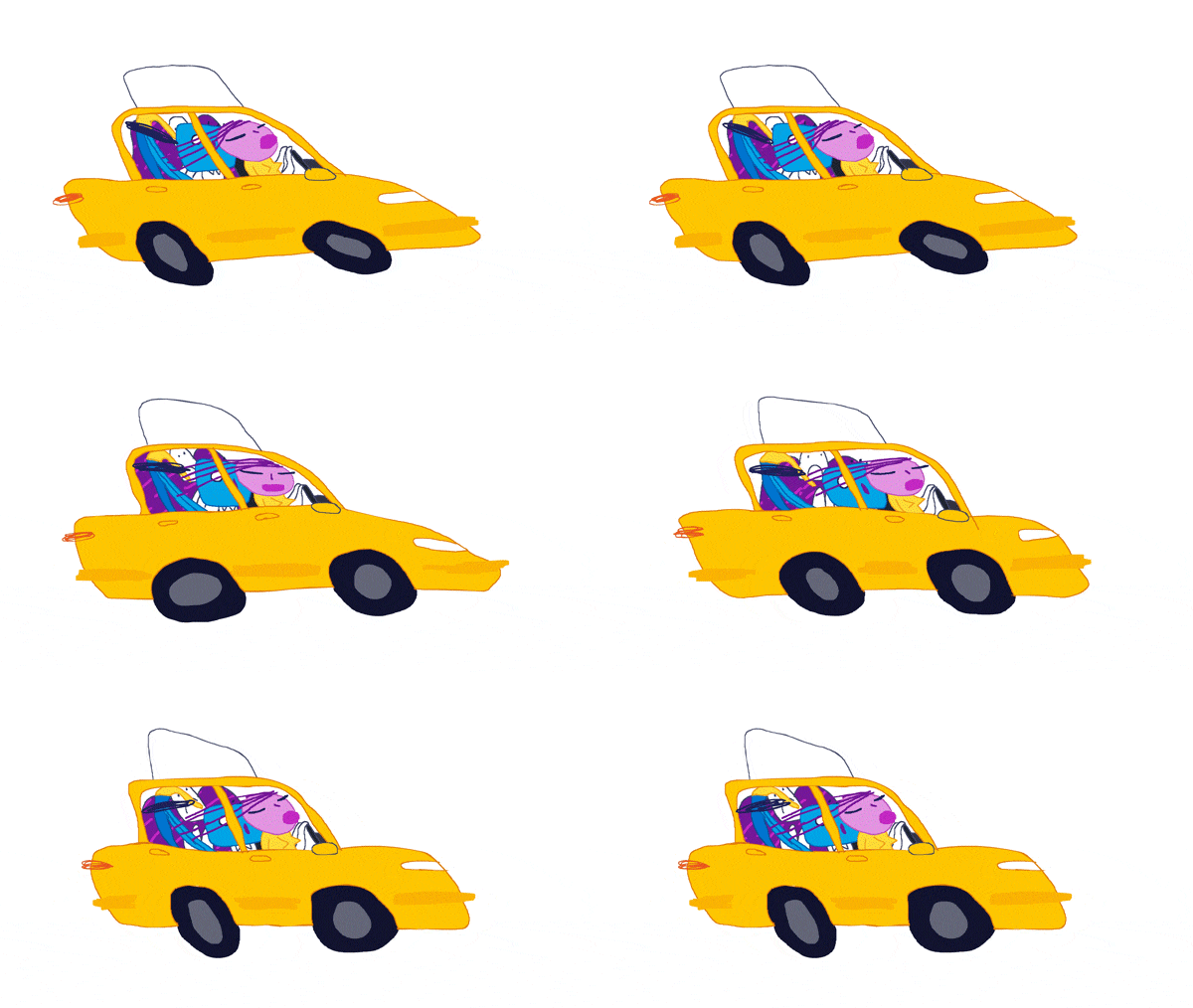
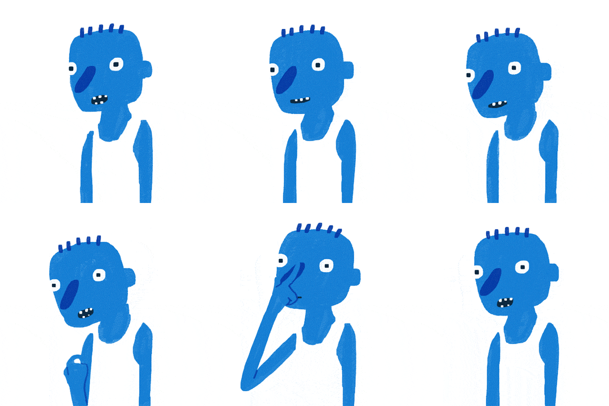
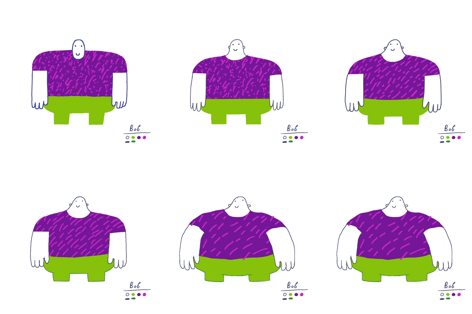
Jan, the girl, is too bossy and impatient. Q, the bird, is a paranoid drug addict. Bob, the big guy, is an alcoholic. Carl has no personality, which is why he constantly loses his head.
To emphasize these flaws, I added errors to the design: all the characters are asymmetrical, disproportionate, and their facial features are slightly off.
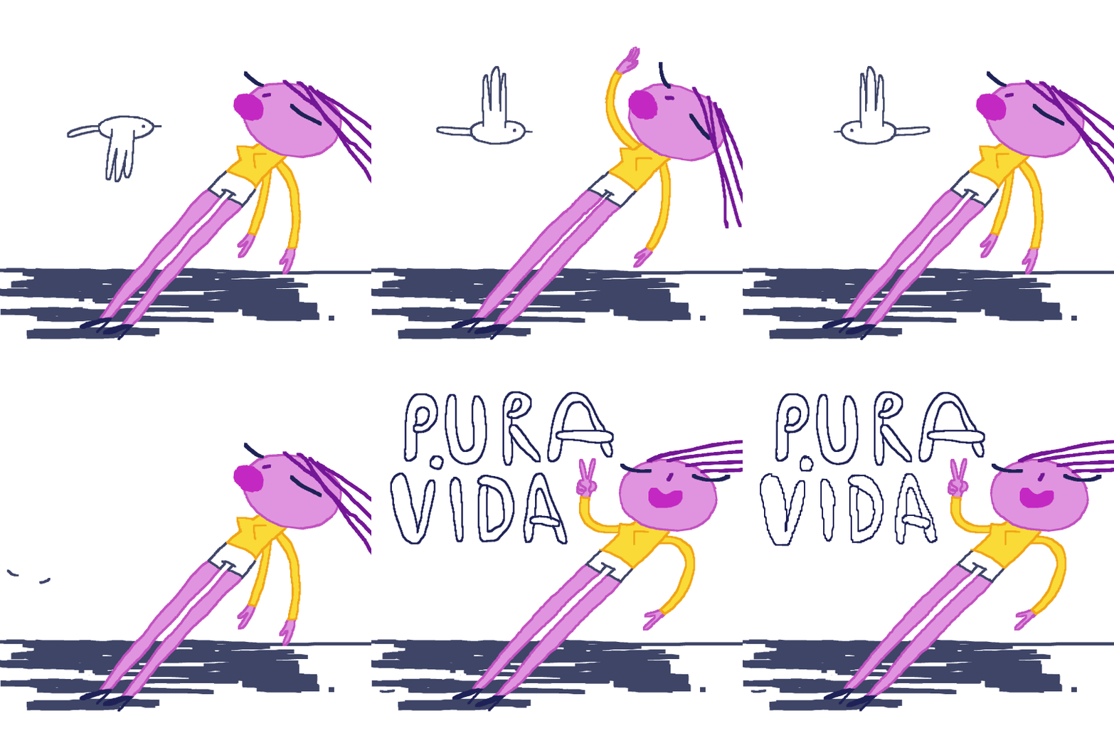
Each character also has an irritating element: Jan has an inclined, off-balance pose; Q has glitching glasses to hide his personality; Bob’s t-shirt has a noisy, animated texture; and Carl has his unstable, detached head.
The secondary characters, Costa Rican locals, have a simple white design to blend in with their surroundings.
initial sliding head idea
early design concept
There were many design iterations before I finally found the right form.
There were two technical challenges with the character design.
The first was that the outlines had different widths and colors, which took a lot of time to color properly.
The second was Bob’s animated pattern on his t-shirt. He had to be animated on three layers: his body, the t-shirt, and the animated pattern.
As a reference for Carl, I built a papier-mâché puppet with a detachable head attached by a magnet.
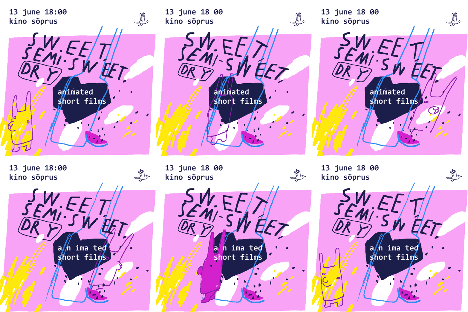
The world premiere of Pura Vida was at a local cinema in Tallinn, along with other graduation films.
I created a poster for the event featuring Antonio, the mysterious character from the film who lives inside a volcano and wears an alpaca mask. He’s hidden in the background in almost every scene!

awards
Best Animated Film at Shorts That Are Not Pants Film Festival (Canada, 2019)
Original Design award at Animation Block Party (USA, 2018)
Short of the Week (USA, 2018)
Nomination for the Best Student Film at European Animation Awards (France, 2018)


